Frame
Use the hds-frame class to create a responsive container with consistent proportions to
enclose content.
Frame is a set of layout utility classes to help you organize content that can adapt to any device or screen size.
<div class="hds-frame" style="max-inline-size: 20rem;">
  <div></div>
</div>
Examples
Frames are well-suited for images and image placeholders.
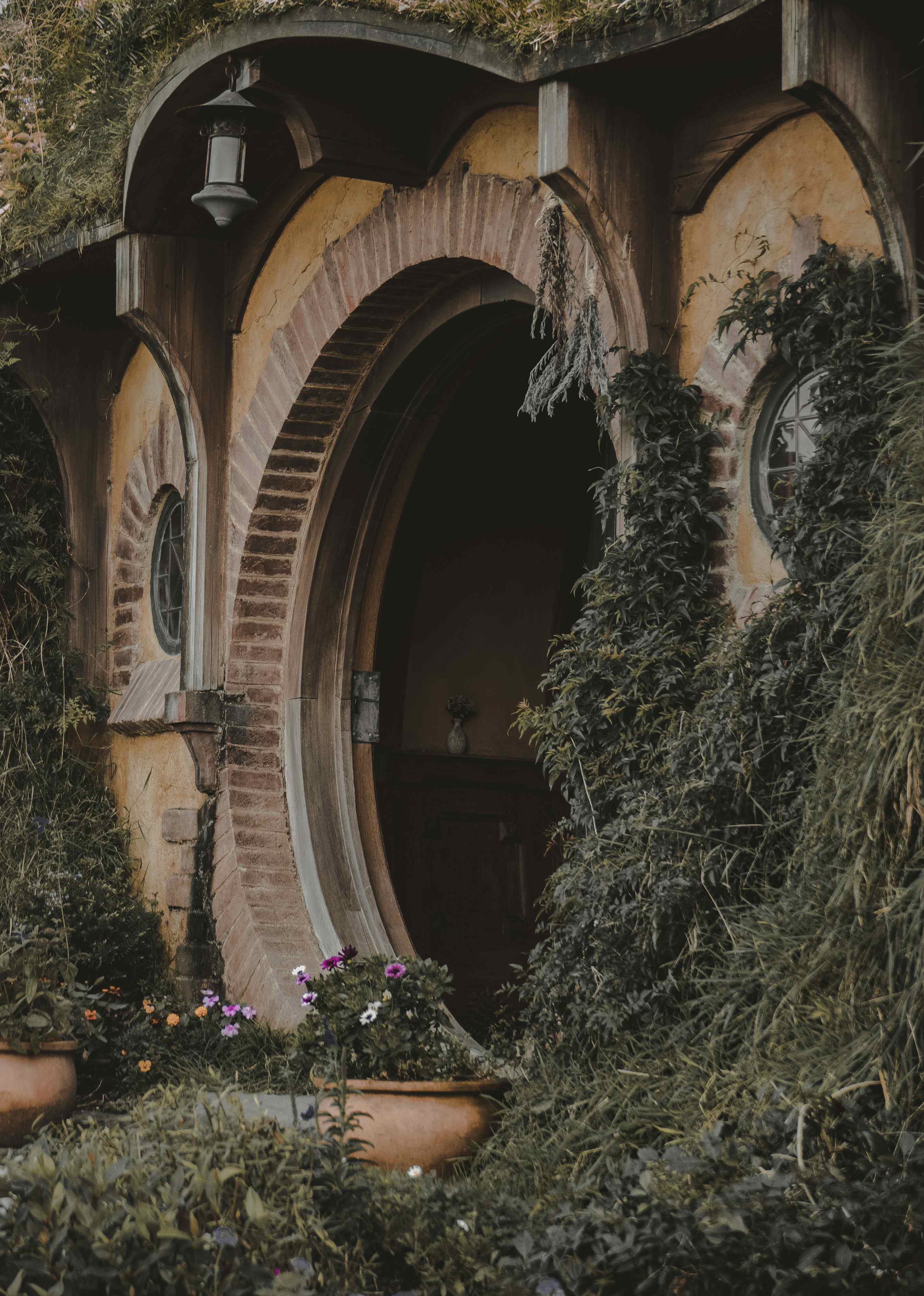
The Lord of the Rings: The Fellowship of the Ring
J.R.R. Tolkien<div class="hds-flank" style="--flank-size: 8rem;"> <div class="hds-frame hds-border-radius-base"> <img src="https://images.unsplash.com/photo-1523593288094-3ccfb6b2c192?q=20" alt="" /> </div> <div class="hds-flank:end" style="--content-percentage: 70%"> <div class="hds-stack hds-gap-xs"> <h3>The Lord of the Rings: The Fellowship of the Ring</h3> <span>J.R.R. Tolkien</span> </div> </div> </div>
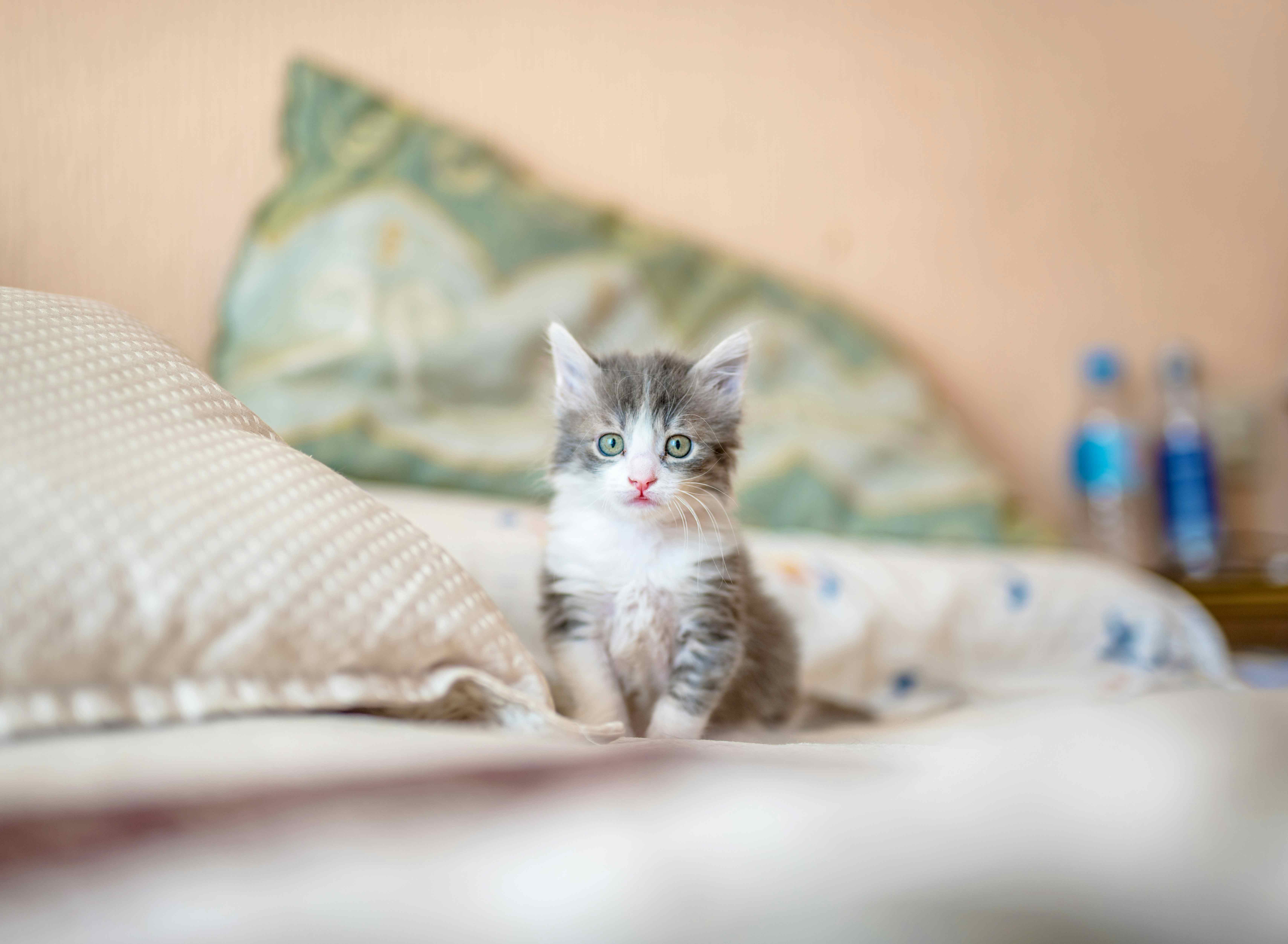
White-socks
Kitten • Male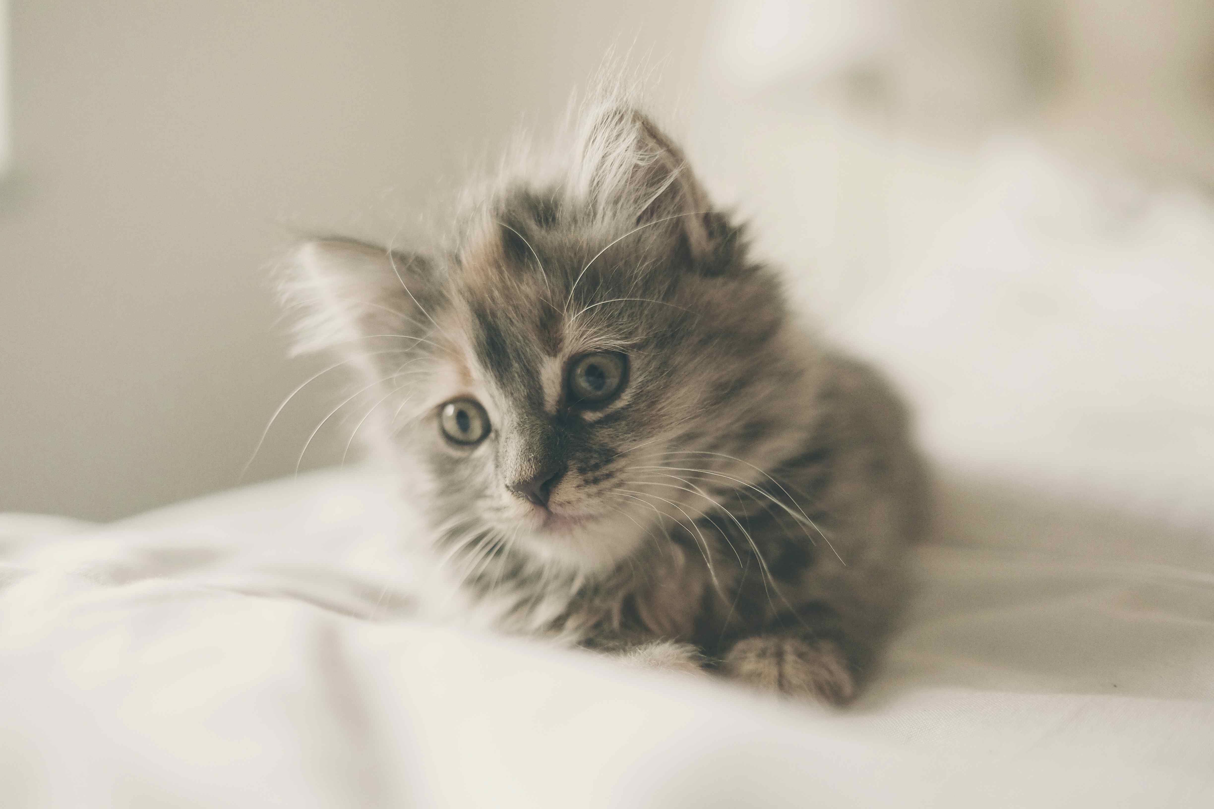
Swish-tail
Kitten • Female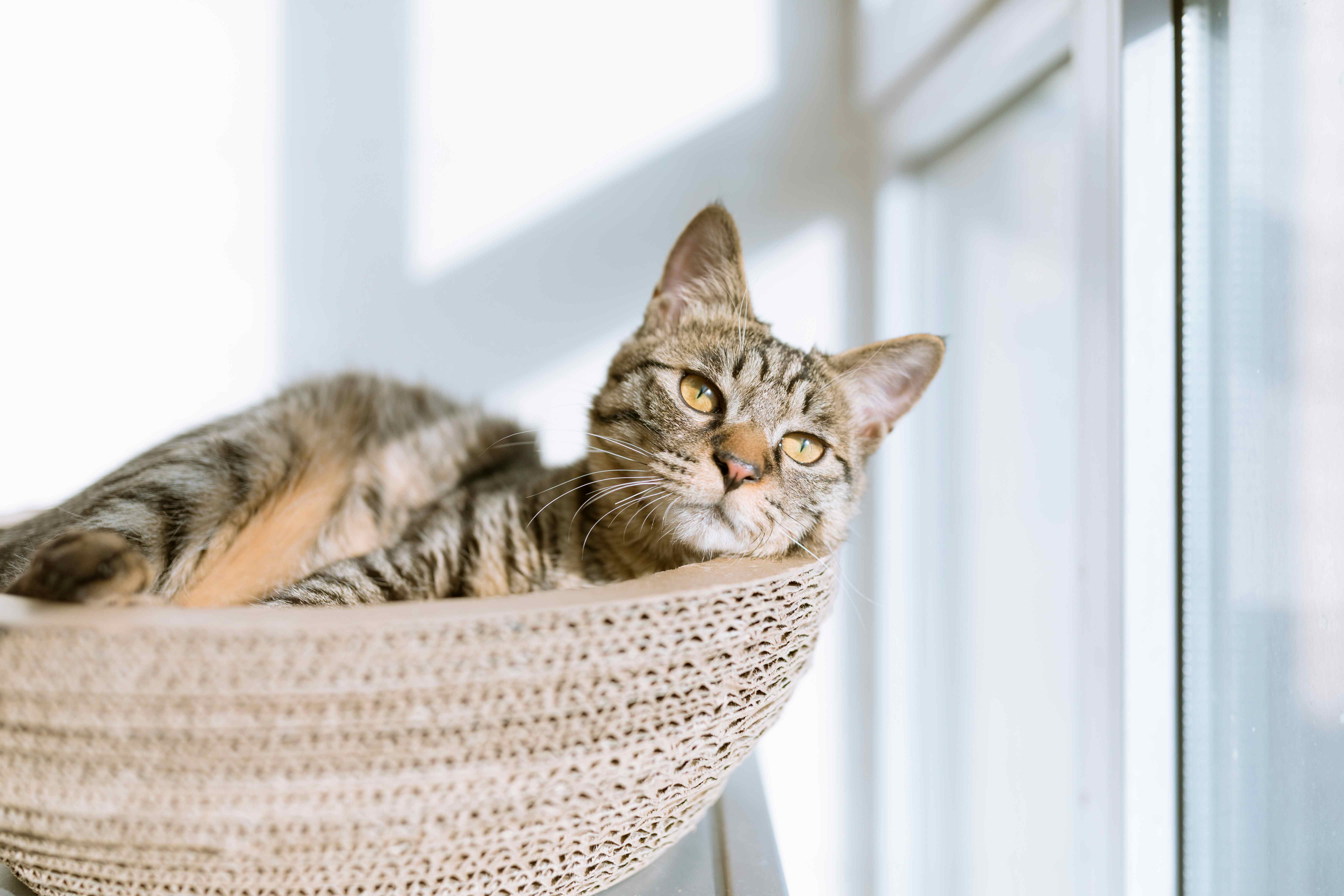
Sharp-ears
Adult • Female<div class="hds-grid" style="--min-column-size: 25ch;"> <sl-card> <div class="hds-frame:landscape" slot="image"> <img src="https://images.unsplash.com/photo-1533743983669-94fa5c4338ec?q=20" alt="Grey and white tabby kitten" /> </div> <div class="hds-stack hds-gap-xs"> <h3 class="hds-heading-m">White-socks</h3> <span class="hds-body-s">Kitten • Male</span> <div class="hds-flank:end hds-gap-xs"> <sl-button size="small" appearance="filled" variant="secondary">Adopt this pet</sl-button> <sl-button id="fav-whitesocks" size="small"> <sl-icon name="heart" variant="regular" label="Favorite"></sl-icon> </sl-button> <sl-tooltip for="fav-whitesocks">Favorite</sl-tooltip> </div> </div> </sl-card> <sl-card> <div class="hds-frame:landscape" slot="image"> <img src="https://images.unsplash.com/photo-1445499348736-29b6cdfc03b9?q=20" alt="Diluted calico kitten" /> </div> <div class="hds-stack hds-gap-xs"> <h3 class="hds-heading-m">Swish-tail</h3> <span class="hds-body-s">Kitten • Female</span> <div class="hds-flank:end hds-gap-xs"> <sl-button size="small" appearance="filled" variant="secondary">Adopt this pet</sl-button> <sl-button id="fav-swishtail" size="small"> <sl-icon name="heart" variant="regular" label="Favorite"></sl-icon> </sl-button> <sl-tooltip for="fav-swishtail">Favorite</sl-tooltip> </div> </div> </sl-card> <sl-card> <div class="hds-frame:landscape" slot="image"> <img src="https://images.unsplash.com/photo-1517451330947-7809dead78d5?q=20" alt="Short-haired tabby cat" /> </div> <div class="hds-stack hds-gap-xs"> <h3 class="hds-heading-m">Sharp-ears</h3> <span class="hds-body-s">Adult • Female</span> <div class="hds-flank:end hds-gap-xs"> <sl-button size="small" appearance="filled" variant="secondary">Adopt this pet</sl-button> <sl-button id="fav-sharpears" size="small"> <sl-icon name="heart" variant="regular" label="Favorite"></sl-icon> </sl-button> <sl-tooltip for="fav-sharpears">Favorite</sl-tooltip> </div> </div> </sl-card> </div>
Aspect Ratio
Frames have a square aspect ratio by default. You can append :square (1 / 1),
:landscape (16 / 9), or :portrait (9 / 16) to the hds-frame class
in your markup to specify an aspect ratio for the frame. Alternatively, you can define the
aspect-ratio property to set a custom proportion.
<div class="hds-grid">
  <div class="hds-frame:landscape">
    <div></div>
  </div>
  <div class="hds-frame:portrait">
    <div></div>
  </div>
  <div class="hds-frame" style="aspect-ratio: 4 / 3;">
    <div></div>
  </div>
</div>
Border Radius
Frames have a square border radius by default. You can add any of the following
hds-border-radius-* classes to an element with
hds-frame to specify the border radius:
hds-border-radius-shds-border-radius-mhds-border-radius-lhds-border-radius-pillhds-border-radius-circlehds-border-radius-square
Alternatively, you can define the border-radius property to set custom rounding.
<div class="hds-grid">
  <div class="hds-frame sl-border-radius-l">
    <div></div>
  </div>
  <div class="hds-frame sl-border-radius-circle">
    <div></div>
  </div>
  <div class="hds-frame" style="border-radius: 50% 0%;">
    <div></div>
  </div>
</div>