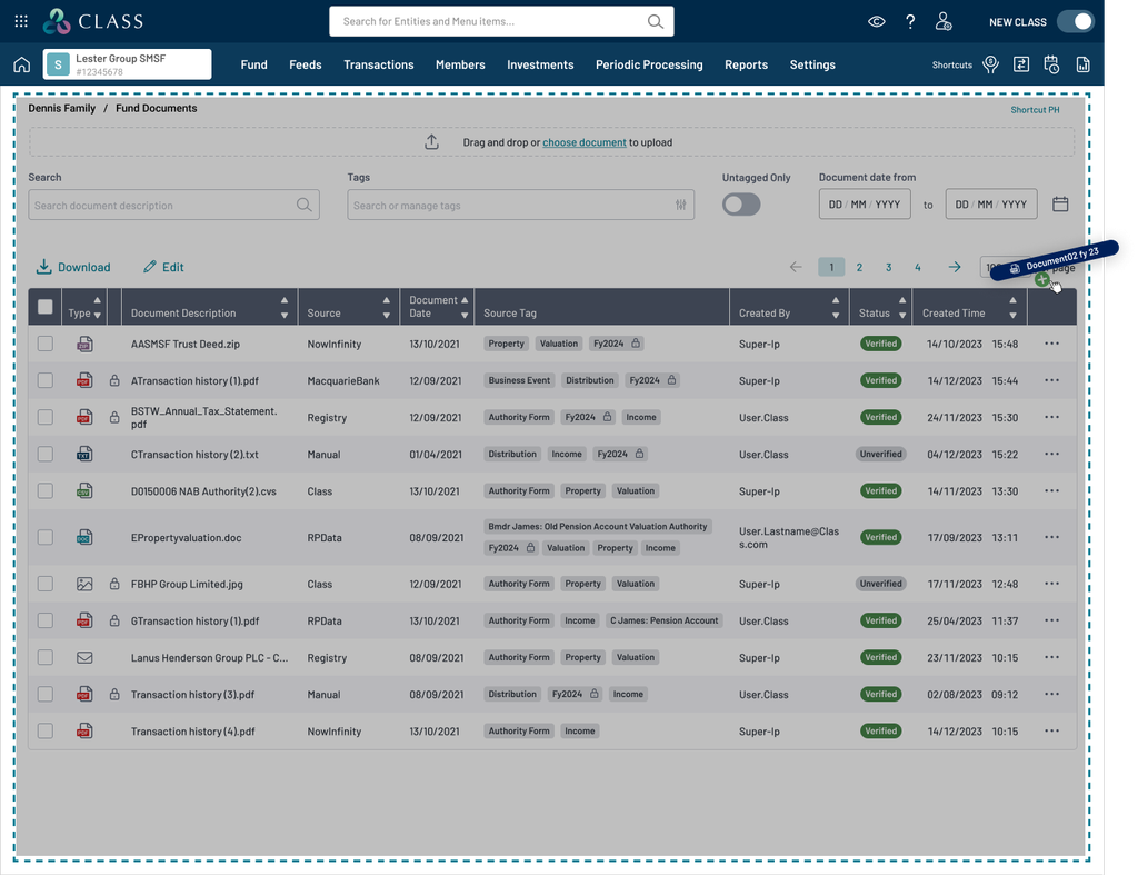
File uploading
File uploading allows people to upload a file or files from their desktop or another location for use by the application or another process.
File uploading design patterns are varied and dependant on context. Designing solutions for file upload require making decisions about structure, sequence, interface elements, labels, help, and providing user feedback.
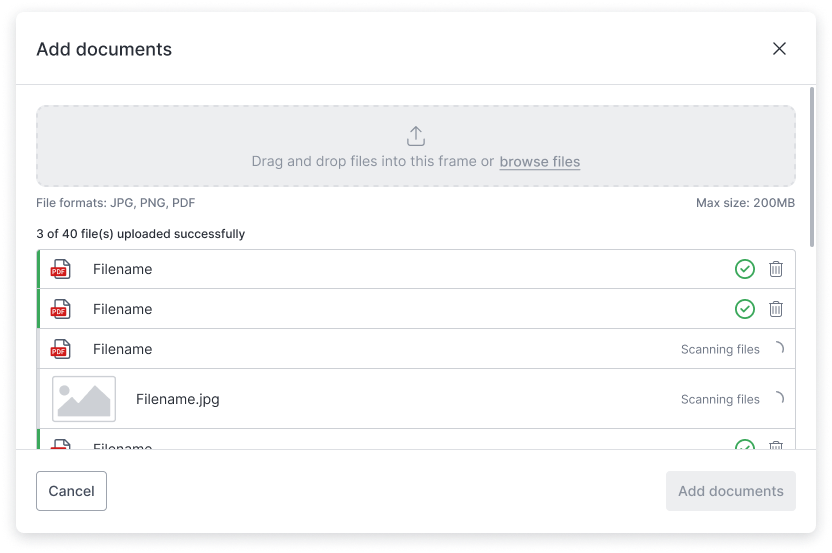
The component is designed to handle both a single file upload or multiple files uploads.
The user experience is dependent on application requirements such as the need to scan documents for virus or machine learning workflows and considerations about application architecture, specifically around how the back end processes files and communicates this to the front end. Events and labels can be set by the file item component to pass feedback to the front end component.
Upload field behaviour
The upload field comprises of a drag and drop region, a select files button or link, an upload icon, form label and hint text, an upload heading, and a file upload description.
The size of drop zone depends on the expected behaviour from the user.
| Dropzone = lg | Dropzone = sm |
|---|---|
| A user will be uploading many files, they will be dragged from a local storage directory, generally the contents of a folder. |
A user will be uploading a small number of files (1 – 5) files, they will be dragged from a local
storage directory, or the file explorer may be used to select files. The upload action is within a form or other workflow where there is a flow of action within a page |
| A larger drop zone helps the user drag a longer list of individual files into the field. | A smaller drop zone helps the user get through the activity within the workflow. |
A drop zone makes it easier for users to upload files on a desktop computer, simplifying the upload process, it feels natural for a use to drag files to a zone. It is typically helpful for when uploading multiple files or an image file.
The drop zone states help the user understand the status of the drop zone.
- Default
- Hover - confirms the action and area of the drop zone
- Disabled - allows the application to set rules on maximum file size or file counts or some other method for not allowing files to be uploaded, help text should be set by the application relevant to the use case.
Upload field behaviour exception
There are some scenarios where the dragging files to the intended screen will highlight the full screen area as an active dropzone to freely drop the files anywhere on the whole screen. This should be determined by the application developer of the project.
Select files button or link
The drop zone contains a button or link to allow a user to select and trigger the native browser or app file manager window to appear so that the user can browse and select a file or files.
In cases when a drop zone is not appropriate any button or text link could act as a trigger to upload a file.
Upload feedback
When a user has uploaded a file or files, upload feedback should always be provided to help them understand the status of the upload. Feedback may be required on the individual file items or the group of file items.
File item states help the user understand status of files being uploaded.
- Loading - indicate the file is loading, a loading label can be used to indicate progress if this is possible or the status of the loading
- Success - indicate the file is uploaded and the available meta data and validations if applicable
- Error - indicates when a file has failed to upload and error states where applicable
Upload component feedback
Alert messages and the file item group can be used to provide feedback on the items within the group. This will provide feedback on the overall progress of uploaded files.
| File item group - file count, can provide feedback on the group, like a count of files or of file size. | File item group - file count, can provide feedback on the group, like a count of files or of file size. |
|---|
Overflow of file items
When a file uploader with file items overflow the view in a page or parent element (such as a modal, dialog, etc), the expected behaviour is that scrolling is enabled for the page or parent element and not within the file item group.
Error messages
Standards for error messages where possible should be followed.
- {filetype} is not a supported filetype
- more to come
Events
This work is TBC
Scanning files for
- Viruses
- Machine learning/AI workflows
- OCR
- …
Accessibility
This work is TBC
- Keyboard controls
- Screen readers